Trainer
Defining what AI should produce and deciding which outputs are worth showing to users.
For me, designing with AI means defining what good model output looks like, deciding what belongs in the experience, and turning recurring team questions into tools people can use themselves.
When we built image translation, the first version did exactly what it was supposed to: detect text, translate it, display it. But walking through the output, I kept feeling like something was wrong. The translations were accurate. The experience was not.
The problem was not the algorithm. It was that no one had defined what good should look like from a user experience perspective. That was a design problem.
Defining what AI should produce and deciding which outputs are worth showing to users.
Using AI to create tools that solve real problems for the designers around me.
The problem
Walking through the first version of image translation, I kept feeling like something was off. The translated text was clean, but it didn't belong — stripped of the visual personality that made the original content worth looking at.
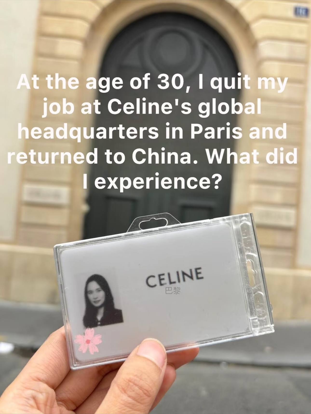
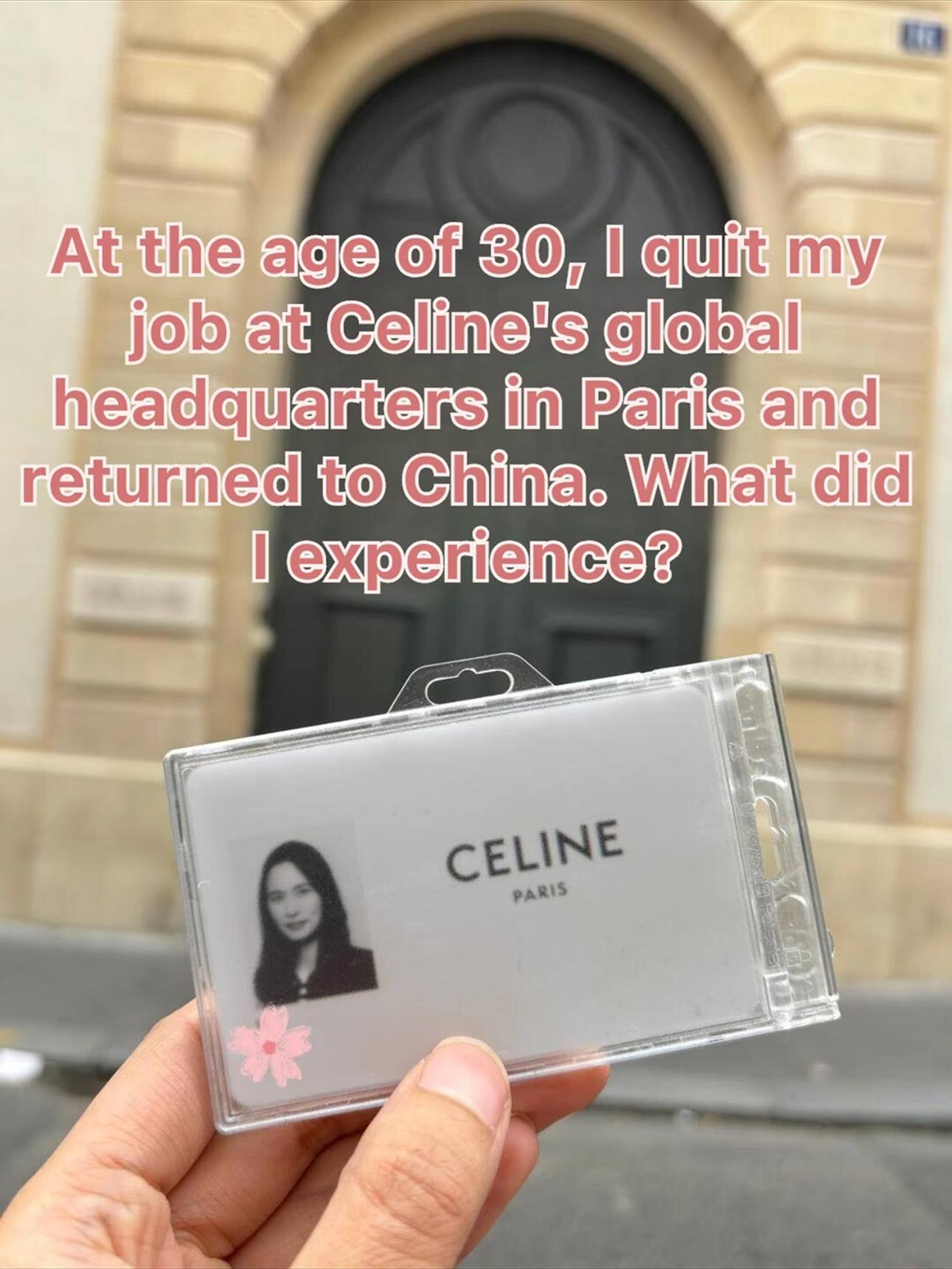
I went back through hundreds of real posts and started mapping what I saw. Most text on rednote images isn't body copy — it's headlines, handwritten notes, stylized labels. Bold, delicate, outlined, colored. Each carrying a visual personality the translation had flattened into a single default style.
The first version of image translation

The framework
Working with my PM, I defined a new labeling framework around one question: does it preserve the original's visual intent? That meant defining visual dimensions the model had never been asked to recognize: Text scale, Stroke style, Color, Text background, Font weight, Script type, Layout density.
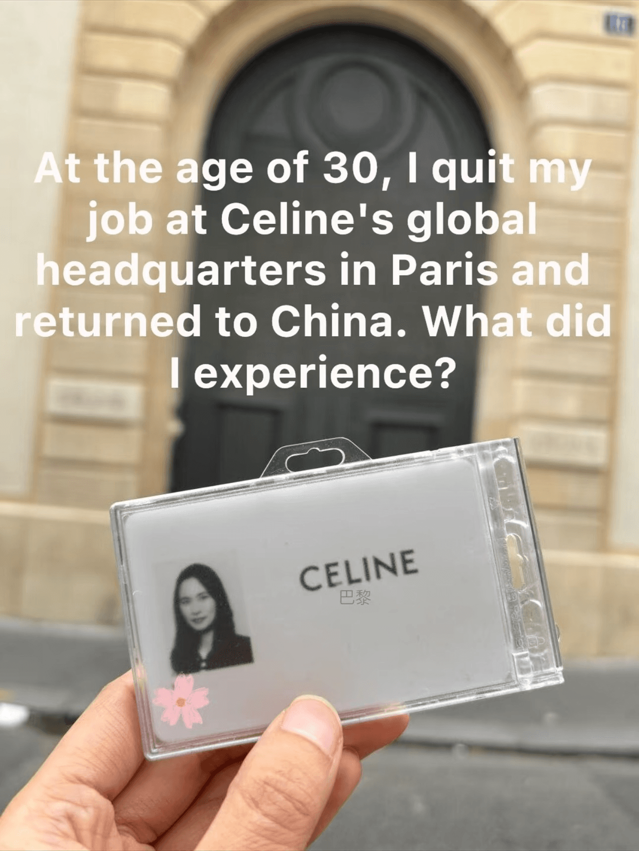
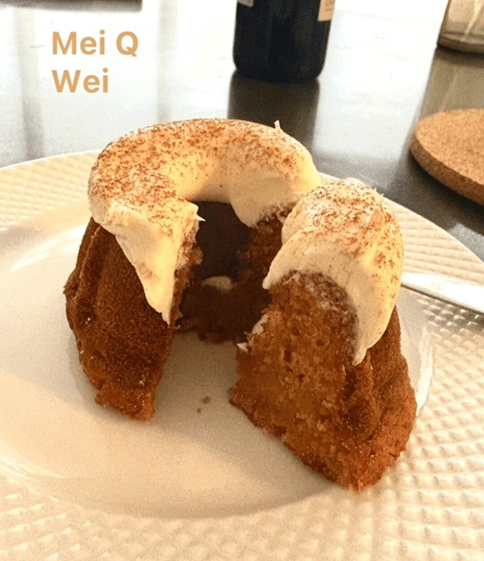
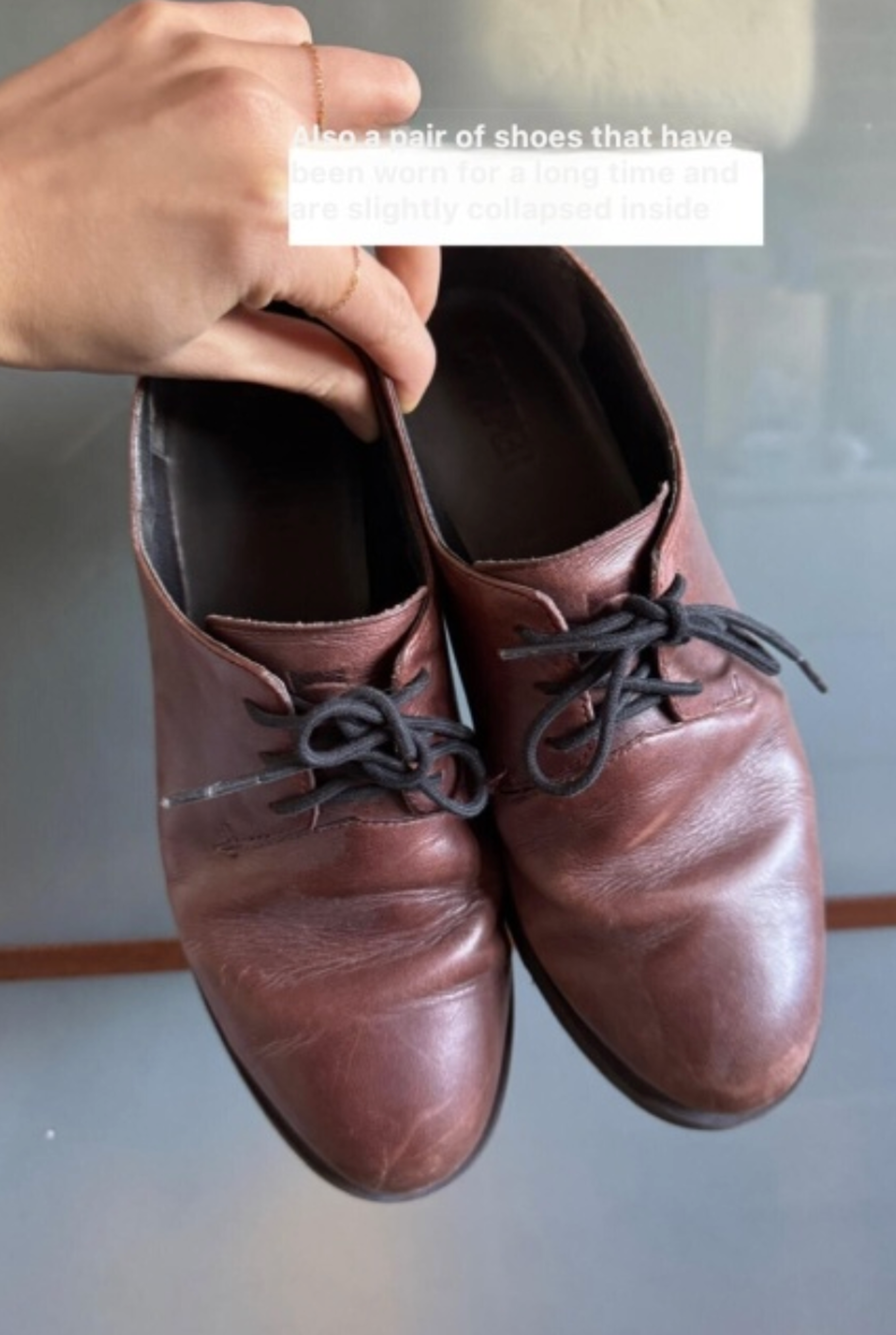
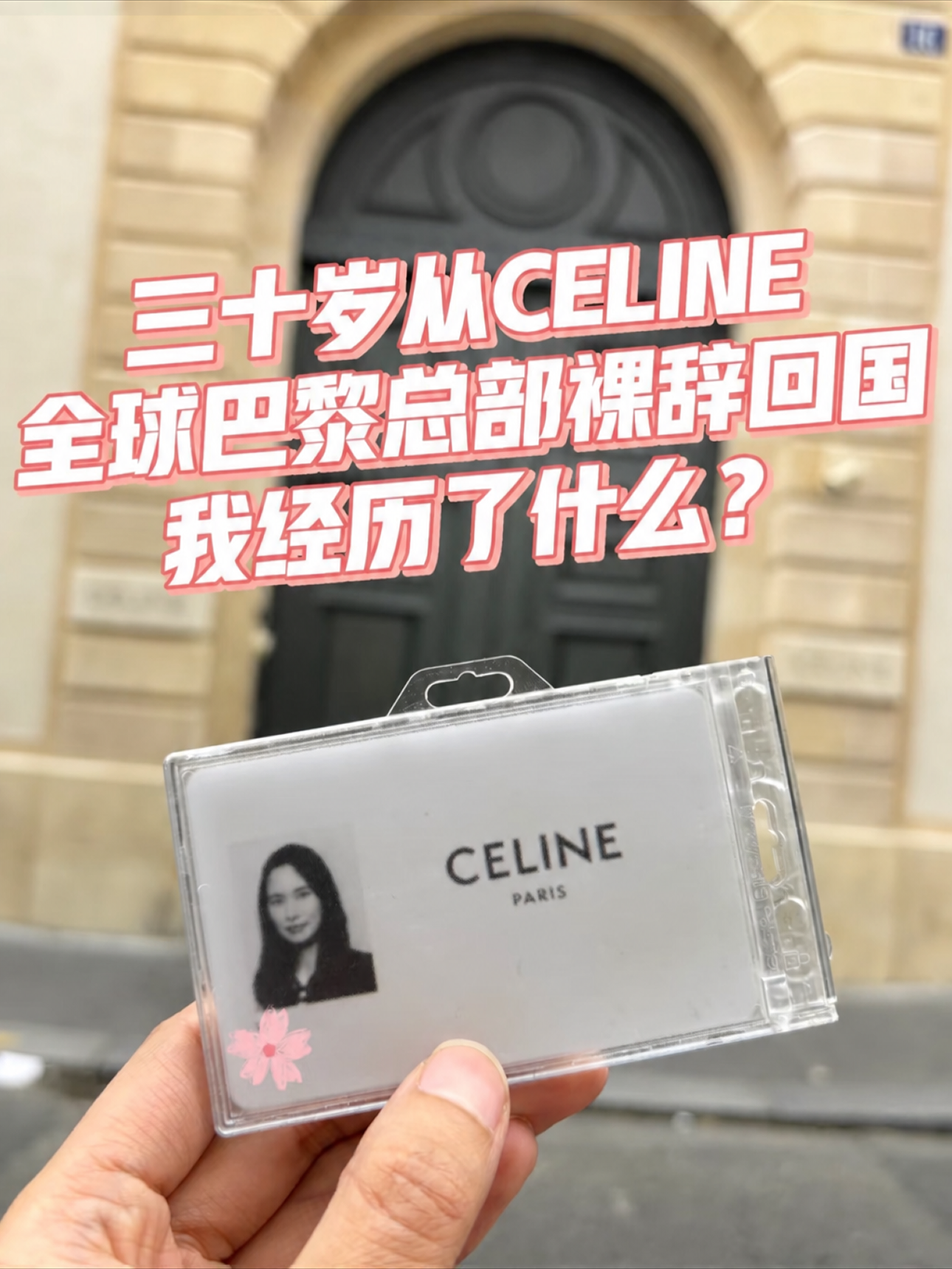
We translated those dimensions into concrete, checkable attributes. The matrix below shows four examples: Large title, Has stroke, Has color, and Has background. From there, we used the framework to label, test, and refine the model until its output began to match the visual intent we had defined.
| Example | Large title | Has stroke | Has color | Has background |
|---|---|---|---|---|
| CELINE headquarters post | Yes | Yes | Yes | No |
| Autumn cake post | No | Yes | Yes | No |
| Jeju Island travel guide post | Yes | Yes | Yes | No |
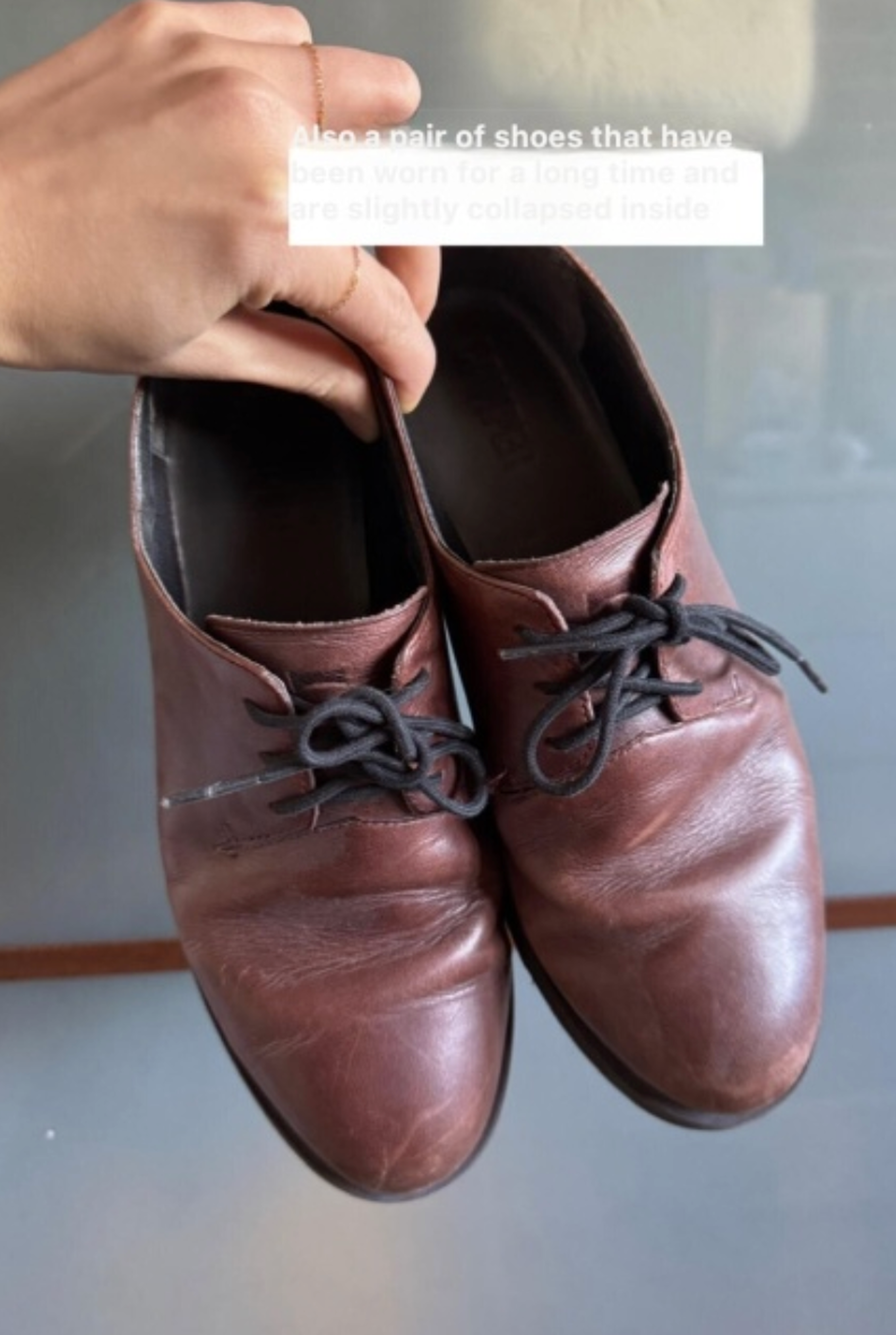
| Worn shoes post | No | No | No | Yes |



The result
With the labeling framework in place, the model's text-style recognition accuracy increased from 29.6% to 61.8%.
Still, one product question remained: should video covers also be included in the translation flow? Translating them could create a brief mismatch: the cover would appear in English, but text inside the video would still be Chinese. Because consistency across the feed mattered more, I chose to include video covers in the same translation flow, accepting the mismatch once users opened the video.
The A/B test evaluated the full translation experience, including video covers. In the English-language segment, feed engagement time increased by 4.3% and feed card CTR by 1%.
original
before
after

Beyond visuals
The same approach extended to voice dubbing. When we noticed regional accents carrying over across languages—for example, a Sichuan-accented Chinese speaker becoming a Sichuan-accented English voice—I treated it as a cross-cultural labeling question, not just a technical problem.
Instead of assuming the same accent should carry over unchanged, I worked with the ML team to adjust how much of it the dubbed voice should retain in another language. The question was not whether the model could reproduce the accent, but whether it would carry the same meaning for a different audience.
Defining "good" for an AI isn't always about pixels. Sometimes it's about what feels human.
The problem
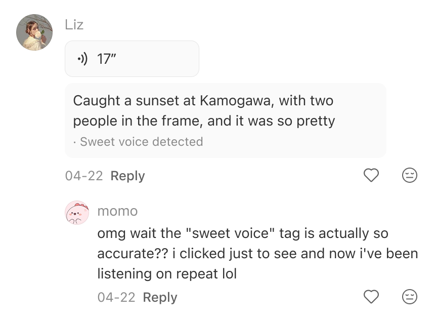
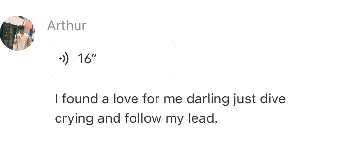
When we shipped voice comments, transcripts appeared by default so users could read a comment before choosing whether to listen. That kept the experience quiet, but raised a harder question: if users could already read the comment, what would make the voice itself worth hearing?

The framework
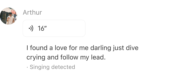
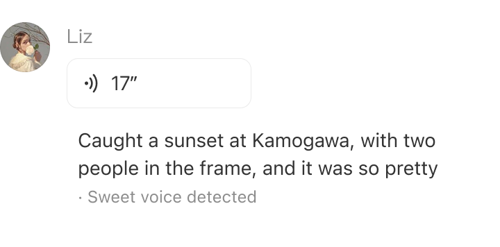
The tag was our solution: one small label that gives you a reason to listen before you've heard anything.
My PM and I developed a classification framework covering timbre, dialect, emotion, music style, and ambient sound. A tag appeared only when one of those qualities was distinctive enough to call out.
The result
The framework gave us a shared way to review early model outputs, decide which qualities deserved a tag, and iterate as the rollout expanded. After launch, a user called the "sweet voice" tag accurate and said it made them tap and keep listening.
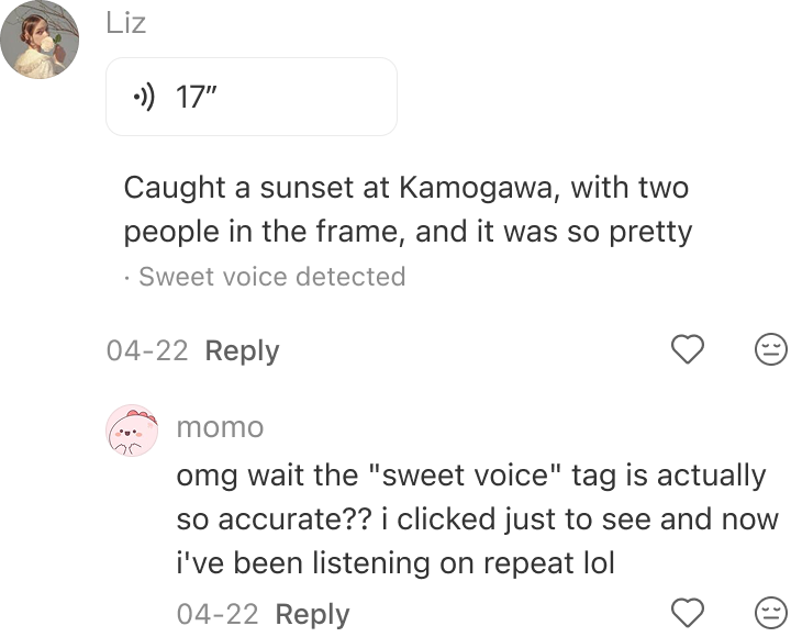
The tag was the visible result. The larger takeaway was a new design responsibility.
Define not only what "good" looks like for the model, but which of its outputs deserve a place in the user experience.
The same questions kept coming back, so I built tools that teammates now use to find the answers themselves.
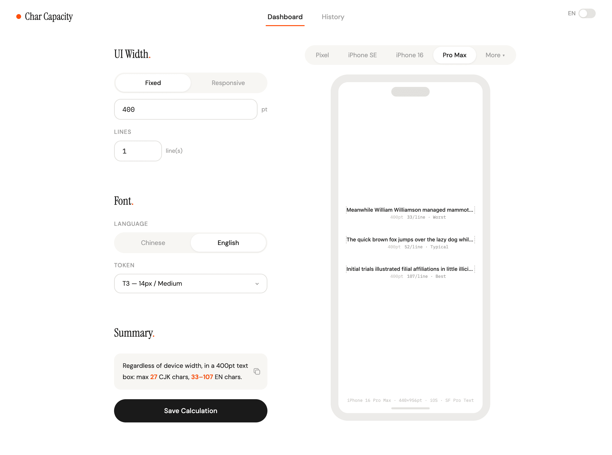
In multilingual UI, text length isn't just a visual question — it's an input constraint for the translation system. We needed translated text to preserve its meaning while fitting within the available space across our most common screen sizes.
Using Claude Code, I built a character counter that turns container width, line count, language, and type style into practical text-length limits, replacing repetitive manual estimation for designers, PMs, and engineers.
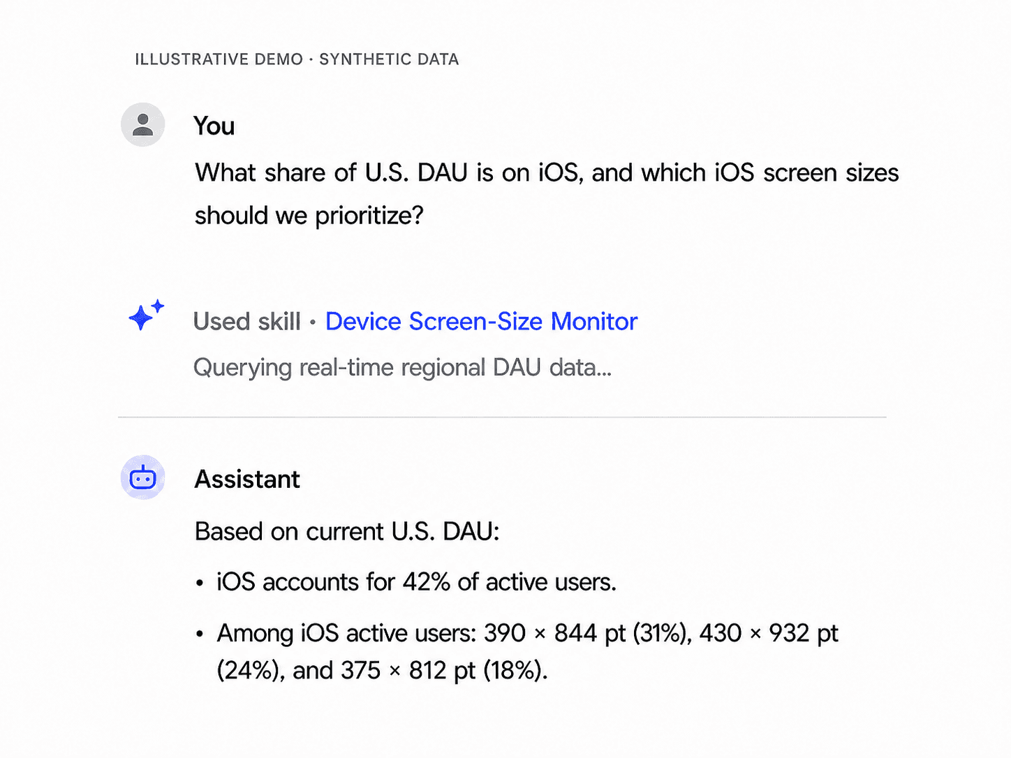
Device distribution informed critical product decisions: which users and edge cases to prioritize, how far layouts needed to flex, and how much copy each UI could accommodate. Yet our analytics captured device models without mapping them to the logical screen dimensions designers use, so no existing query could answer those questions.
Starting with engineering’s device-model list, I used AI to research and cross-check the logical screen dimensions for each model, creating a maintainable lookup table that I joined with real-time regional DAU data. I packaged the query and summary logic as an internal skill, so designers, PMs, and content teams could make layout and copy decisions from the same device data.
I'm still figuring out how I feel about AI. Some days it's genuinely exciting. I can test an idea or build a small tool much faster than I could before. Other days, the pace of change makes me uneasy because the tools and the way we work together keep changing. One thing does feel clear to me:
Although AI lowers the barrier to building, good judgment and taste are still what make the result worth using.