Before / composer
A text-only comment composer
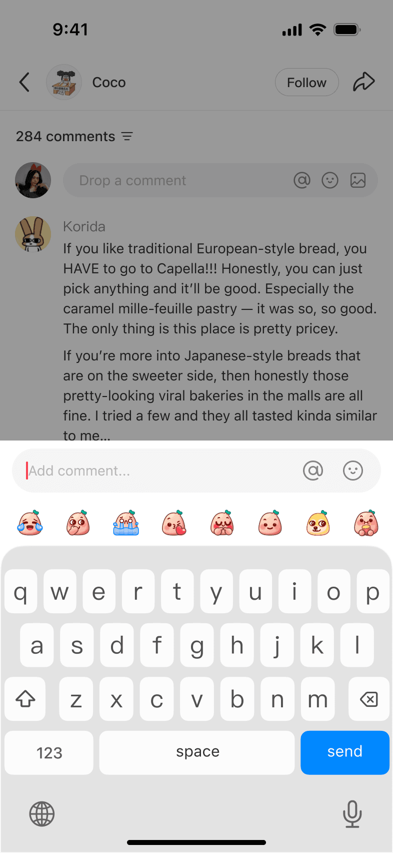
rednote was built on a simple promise: real people sharing real lives. By mid-2024, comments had become its second-largest source of user-generated content.
People were already exchanging advice and experiences there, but the only way to reply was with text.
Before / composer
Before / conversation
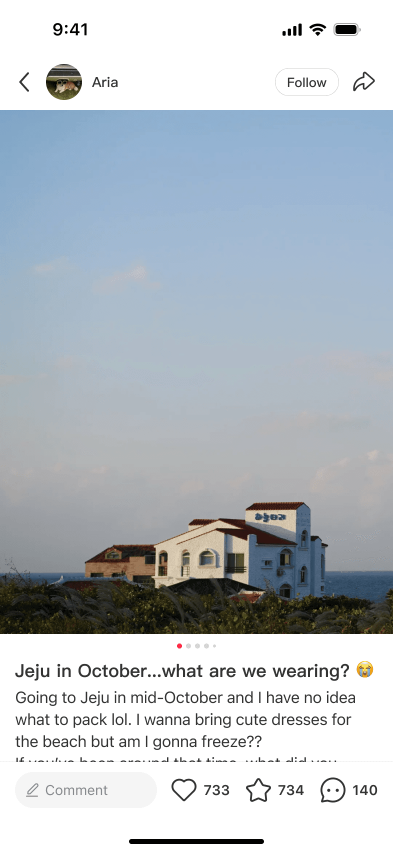
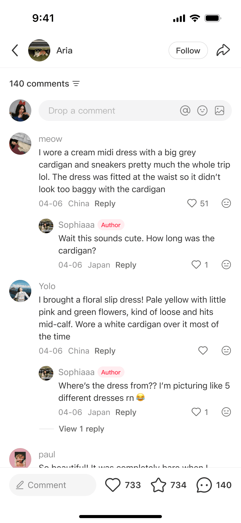
Travel is a good example. A traveler asked what to wear in Jeju in October. People described a cream dress with a gray cardigan and sneakers, or a floral slip dress. She kept asking for details because the outfits were hard to picture. The experience was still text-only.
Images felt like a natural next step because they could show those details right away. The challenge was how to expand the comment experience without killing what made it good.
Image comments weren't new. In our competitive research across Chinese UGC platforms, we saw image replies often used as memes or quick reactions. They were fast and expressive, but didn't always add context to the thread. That left us with a question:
What should an image comment contribute to a conversation on rednote?
My PM and I led a brainstorming session on what people might share and how a thread with images would feel to read. We set two design principles: encourage people to share photos from their own experiences, and keep threads easy to follow. We limited the first release to one image so we could learn from real use, and I applied those principles in two design decisions:
The first concept put camera and album entries side by side in the composer. I moved the camera inside the album picker, leaving one clear image entry in the composer. The aim was to keep replying simple and make it easy to share a photo people already had.

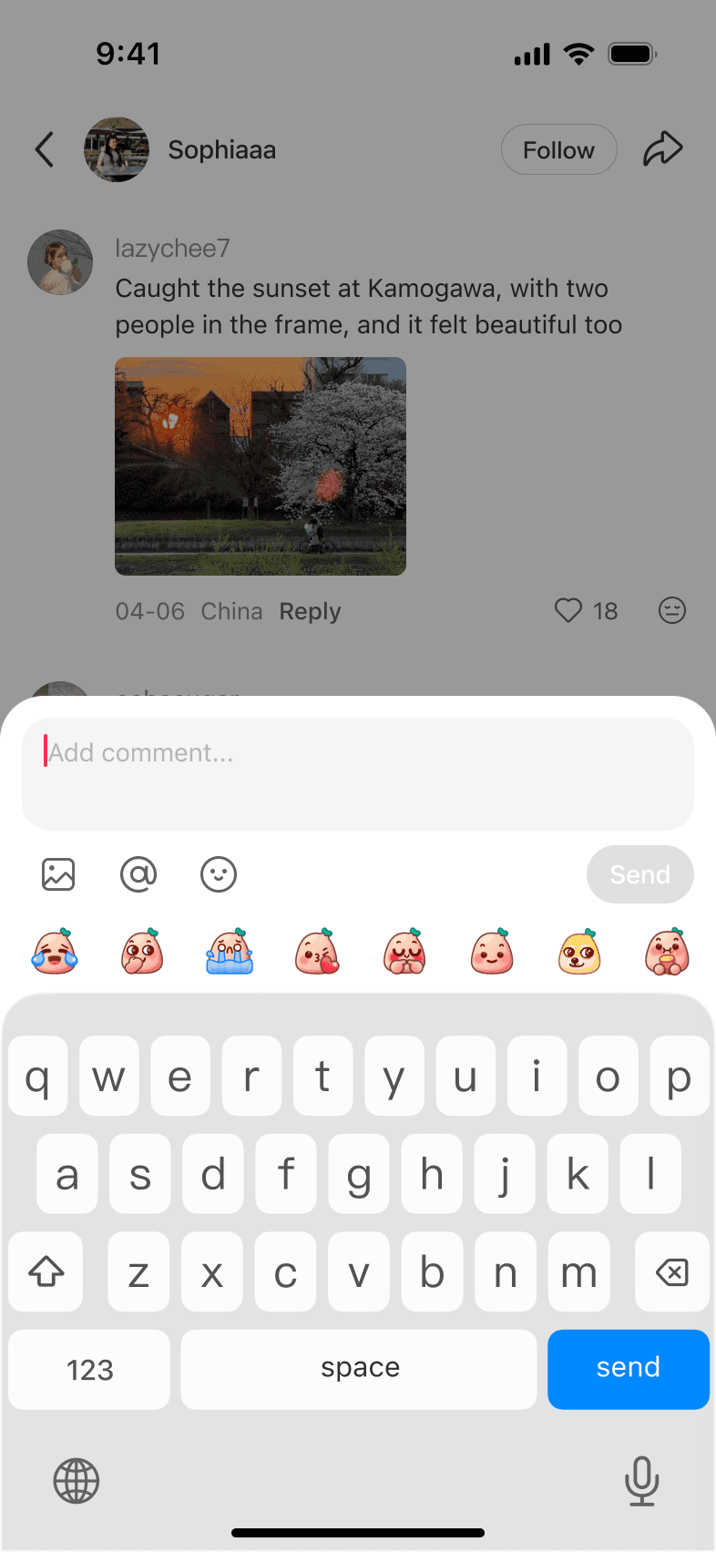
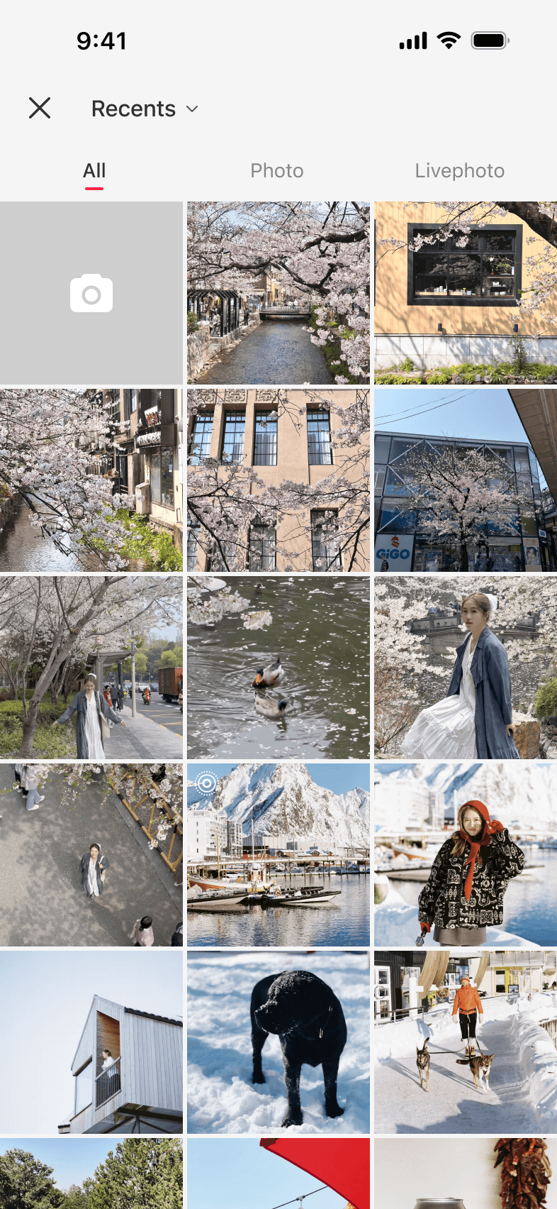
In internal usability testing, we compared a square crop, a large preview, and a more restrained size. The square crop lost image detail; the large preview pushed surrounding replies down. We chose the restrained preview because it showed enough of the photo while keeping the thread easy to follow.
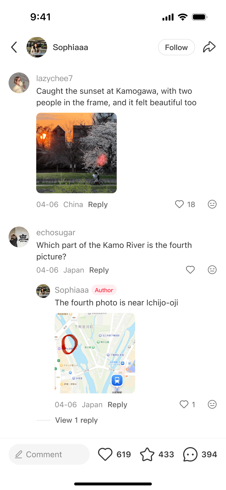
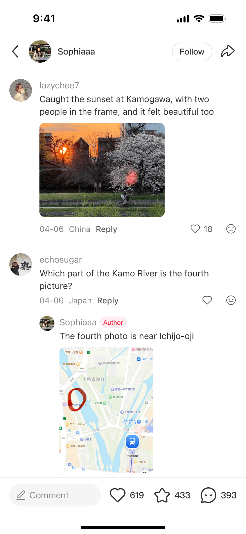
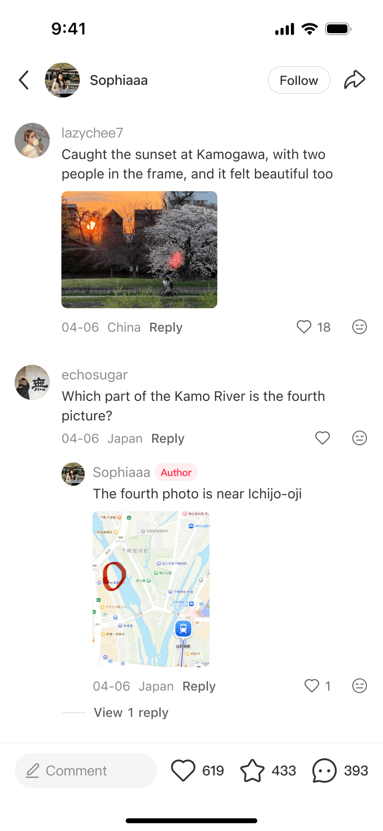
What the community did with it amazed us.
Tap the post to open it, then scroll through the comments.

A plant post turned into a community gallery — people documenting growth, care routines, and small victories in the comments.

A simple prompt became a live gallery of skies, windows, streets, and golden-hour scenes from wherever people were.

A packing question became a real-time style exchange — outfit photos, weather notes, sunburn warnings, and all.

A photo editing tutorial sparked a submission thread — creators teaching, community practicing, all in the comments.
Together, these threads showed how people used a single image to share examples, compare ideas, and build on one another's answers.
Single image proved the concept. In the A/B test, comments per DAU increased 5.03%, with a 3.03% lift in the viewer-to-commenter rate and a 2.03% lift in comments per commenter.
Users started asking for more — so we gave them multi-image. And then publishing dropped.
Before
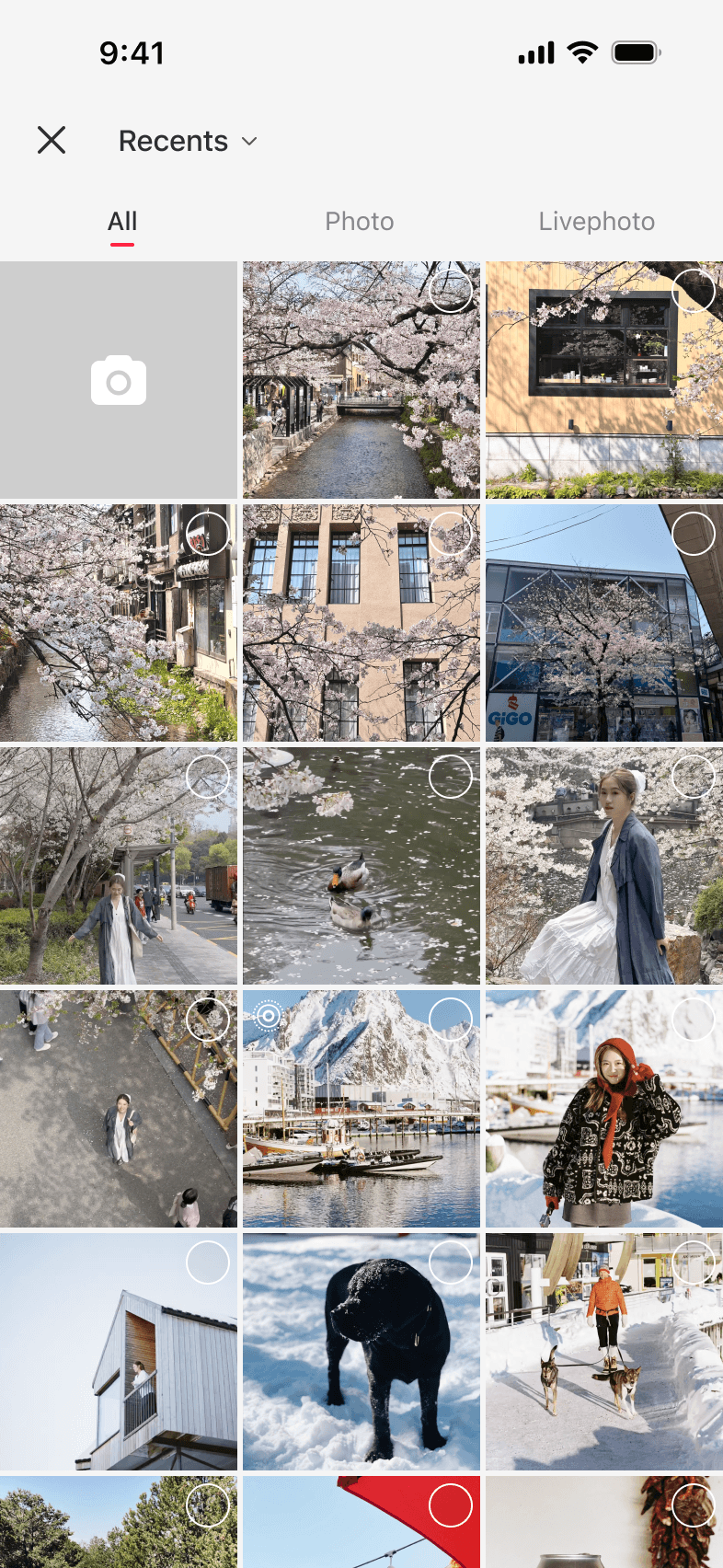
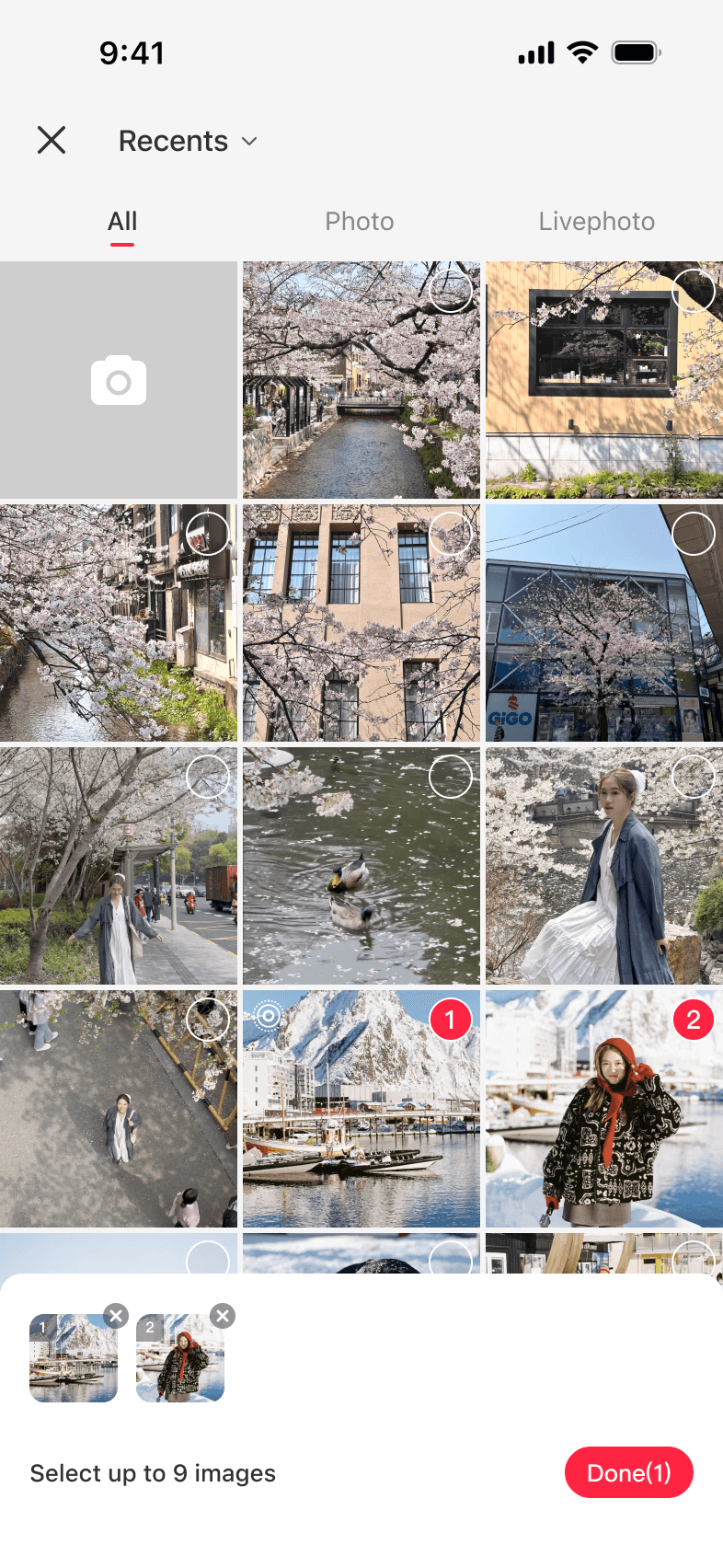
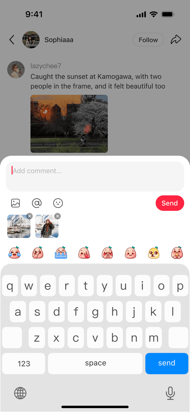
We had launched multi-image with default multi-select in the photo picker, assuming more choice would mean more posts. But only 10% of people who posted an image comment used more than one image. The added steps didn't bring in new commenters; instead, daily commenters fell 0.6%.
After
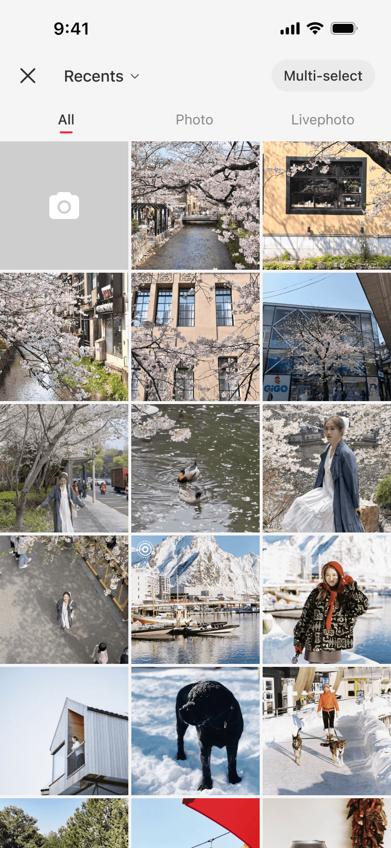


I flipped the default to single-select, kept multi-select available on demand, and added an entry point in the composer so the option remained easy to find. In the follow-up A/B test, the decline in daily commenters disappeared, while the number of images published increased 9.07%.
The lesson wasn't that multi-image was wrong. It was that the default is the product — most users never change it, so whatever you ship as default is what you've actually decided to build.
Images gave people something to show. Voice could carry what photos couldn't: a song, a regional accent, a burst of laughter. But a voice comment had to fit a thread people were used to reading.
Voice is inherently interruptive. How do we make it feel like an enrichment — not a disruption?
That led us to one foundational decision. Voice comments had to work in silent mode first.


Transcripts and tags helped people reading comments. For the person recording, I wanted the waveform to change with their voice as they spoke.
I used AI-assisted coding to prototype how each recording's duration, volume, and rhythm could shape its waveform. Engineers reviewed my prototype code and integrated the behavior into the product. A whisper now looks different from a shout, and a song from a spoken reply.


Users didn't just use voice comments to reply. They started singing.
Someone sang a line as a voice comment. Others replied with the next line, and the chain grew across rednote.
We saw it happening and made it official by turning the behavior into a dedicated singing relay feature. The feature grew directly from what the community was already doing.
By December 2025, six months after launch, 5M+ users had posted at least one voice comment, for a total of 50M+ voice comments and 1B+ plays.
Over 1.5 years, comments grew from text into images, stickers, and voice. The same input patterns then began shaping conversations beyond comments.


After these patterns worked in comments, I defined a shared input framework and led its adoption in DMs and group chats. The input behaviors stayed consistent, while each surface kept its own visual language.
More tools composer


Inline emoji


Voice composer


From May 2024 to Dec 2025, participation and engagement in comments grew alongside the expansion of comment formats.

This project changed how I look for product direction. I learned to keep the first step easy, then pay attention to both the data and what people actually do. The data showed us when the experience was getting in the way, while the community showed us new ways to use it.
Personally, this project means a lot to me because I got to see it grow over time. One feature led to the next, and I was able to bring what we learned into other parts of the app.
Design for what people create together.


Comments — from text to ecosystem
Over 1.5 years, I led the expansion of rednote's text-only comment experience to include images, stickers, and voice. What began in comments later shaped expression across the broader product ecosystem.